

What Is an Email Benchmark? A Practical Guide for Marketers
An email benchmark is a reference number, usually an industry or platform average for a metric like open rate or click-through rate, that you use to judge whether your own campaigns are performing well or badly. It works as a comparison point, not a scoreboard. Think of it as a fair-weather forecast, useful for context, useless as a guarantee.
Three things to know before you compare a single number:
- Core metrics matter more than raw opens. Open rate, click-through rate (CTR), click-to-open rate (CTOR), and conversion rate together tell the real story.
- Context changes everything. An ecommerce flash sale email and a SaaS onboarding sequence should never be judged by the same yardstick.
- Apple’s Mail Privacy Protection (MPP) has scrambled open-rate data industry-wide, pushing smart marketers toward click and conversion metrics for anything that matters.
Brevo’s 2026 benchmark study puts the average open rate at 20.73%, or 33.87% once Apple MPP-inflated opens are included, with average CTR typically falling within a low single-digit range, consistent with industry observations. Numbers like these only mean something once you know what they’re being measured against.
Table of Contents
- What Is an Email Benchmark and Why Does It Matter?
- Key Email Metrics, Formulas, and What They Reveal
- How Benchmarks Change by Industry, Email Type, and Region
- How to Benchmark Your Own Email Program
- What to Do When Your Numbers Fall Short
- Where Benchmarks Mislead You
- What We Watch When We Benchmark Client Programs
- How Take-action Turns Benchmark Gaps Into a Growth Plan
- Turning Metrics into a Repeatable Practice
- Sources
What Is an Email Benchmark and Why Does It Matter?
An email benchmark tells you where you stand, not where you should be. Mailchimp frames it plainly: benchmarks are industry averages that let you compare your open rates, CTRs, and conversion performance against similar senders, provided you’re comparing like with like.
That caveat is the whole game. A benchmark pulled from a broad aggregate report mixes newsletters with abandoned cart flows, B2B drip campaigns with flash sale blasts. Compare your welcome series against that muddy average and you’ll draw the wrong conclusion nearly every time. Knak makes a similar point: benchmarks work best as diagnostic tools rather than fixed goals — the real value is in what a gap reveals about your program, not in hitting some external number.
Key Email Metrics, Formulas, and What They Reveal
Every benchmark conversation starts with the same handful of metrics. Here’s what each one measures, how to calculate it, and what it’s actually telling you.
Delivered rate measures how many emails reached an inbox instead of bouncing. Formula: (Emails Delivered ÷ Emails Sent) × 100.
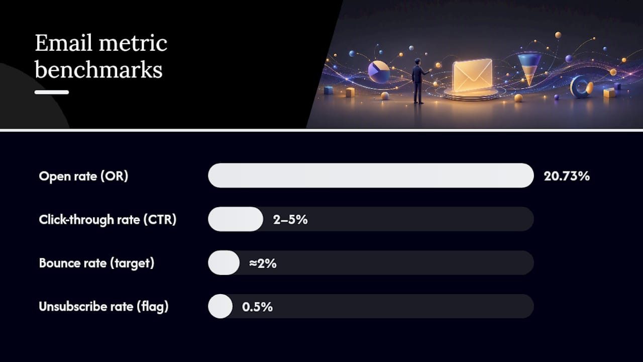
Open rate (OR) tracks how many recipients opened your email. Formula: (Opens ÷ Emails Delivered) × 100. Send 10,000 emails, get 2,073 opens, and your OR is 20.73%, right at Brevo’s 2026 average.
Click-through rate (CTR) measures how many recipients clicked a link. Formula: (Clicks ÷ Emails Delivered) × 100. Salesforce pegs a healthy CTR at roughly 2% to 5%, though that range shifts by industry.
Click-to-open rate (CTOR) isolates content performance from subject-line performance. Formula: (Clicks ÷ Opens) × 100. This is the metric that tells you whether people who opened actually liked what they saw.
Conversion rate tracks the percentage of recipients who completed your target action, purchase, signup, download. Formula: (Conversions ÷ Emails Delivered) × 100.
Bounce rate splits into hard bounces (permanent failures like invalid addresses) and soft bounces (temporary issues like a full inbox). Formula: (Bounces ÷ Emails Sent) × 100. ActiveCampaign recommends keeping total bounce rate under roughly 2%.
Unsubscribe rate measures list fatigue. Formula: (Unsubscribes ÷ Emails Delivered) × 100. ActiveCampaign flags anything above 0.5% as worth investigating.
Spam complaint rate and deliverability round out the health check. High complaint rates tank your sender reputation and drag every future send into spam folders.
Revenue per email (RPE) ties the whole thing to money: total campaign revenue divided by emails sent.
Here’s how these numbers diagnose problems. High open rate paired with low CTR usually points to a content or call-to-action mismatch. The subject line worked. The email inside didn’t deliver. Low open rate with decent CTR among the people who did open suggests a subject-line or deliverability problem, not a content problem. That distinction changes what you test next.
- Check open rate first, but treat it as a soft signal post-MPP.
- Check CTR and CTOR together to separate subject-line performance from content performance.
- Check conversion rate and RPE last. These are the numbers that pay your invoices.
Pro Tip: Prioritize clicks and conversions over opens whenever you’re deciding what “good” looks like. Apple Mail Privacy Protection has inflated open-rate data across the entire industry, so a rising open rate might just mean more of your list uses Apple Mail, not that your subject lines improved.
Pro Tip: Measure over a full send cycle, not a single campaign. One newsletter with a viral subject line will skew your averages for weeks if you let it.
Pro Tip: Segment before you calculate. Blending first-time buyers with five-year repeat customers into one open-rate number hides more than it reveals.
Top performers aren’t just getting lucky. Brevo’s data shows the top 10% of senders achieve roughly double the average open rates and CTR compared to typical campaigns, roughly double the average across both metrics. Our guide to average email open rates breaks down what separates that top tier from everyone else.
How Benchmarks Change by Industry, Email Type, and Region
The single biggest mistake in benchmarking is grabbing one aggregate number and applying it everywhere. A transactional order-confirmation email will almost always outperform a promotional blast on open and click rates, because the recipient is expecting it and actively wants the information inside. Lifecycle and automated flows (welcome series, abandoned cart, post-purchase) tend to land somewhere in between: more relevant than a cold promo, less urgent than a receipt.
Geography moves the needle too. Brevo’s regional breakdown shows European senders averaging a 22.83% open rate (36.90% with MPP included), compared to 17.32% (32.49% with MPP) in North America. Neither number is “wrong.” They’re measuring different audiences with different inbox habits and different regulatory environments around email.
Picking the right comparison group means matching three things at once:
- Industry. Ecommerce, SaaS, and nonprofit audiences behave differently, and averages built from one don’t transfer cleanly to another.
- Email type. Compare promotional against promotional, transactional against transactional, never across the line.
- List quality and size. A highly engaged list of 2,000 recent buyers will outperform a cold list of 200,000 by a wide margin, regardless of industry.
How to Benchmark Your Own Email Program
Building a real benchmark for your own program takes more discipline than pulling one number off a report, but the process is straightforward once you set it up.
- Choose your timeframe. Thirty to ninety days smooths out one-off spikes without going stale.
- Segment by email type. Never mix welcome flows with monthly newsletters in the same calculation.
- Pick a comparable data source. Match your industry and email type against a report like Salesforce’s benchmark data or Mailchimp’s industry averages, not a generic blended figure.
- Set a minimum sample size. Benchmarks calculated from small sample sizes get noisy fast; a few hundred deliveries or fewer will swing your averages wildly from send to send.
- Clean your data. Exclude test sends, internal addresses, and known bad segments before calculating anything.
- Align your definitions. Decide whether you’re measuring against emails sent or emails delivered, and stay consistent every time you recalculate.
- Calculate rolling averages. A rolling 90-day average is far more stable than any single campaign’s numbers.
A quick sample template you can copy into a spreadsheet:
- Metric: open rate, CTR, CTOR, conversion rate, unsubscribe rate
- Timeframe: last 90 days
- Segment: welcome flow, first-time buyers
- Peer benchmark source: industry-matched report, dated
- Notes: list quality, known deliverability issues, any recent list cleaning
Pro Tip: Document your methodology and the date every time you run this. A benchmark from eighteen months ago, before the last round of privacy changes, isn’t a fair comparison to this quarter’s numbers.
HubSpot’s reporting tools make this easier by surfacing engagement and delivery reports side by side, so you’re not stitching together numbers from five different exports. Our email marketing analytics guide walks through building a simple KPI dashboard if you want a repeatable setup.
What to Do When Your Numbers Fall Short
A gap between your numbers and the benchmark isn’t a verdict, it’s a diagnostic starting point. Before you touch anything, confirm the basics: is your sample size big enough to trust, did one outlier campaign skew the average, and is your deliverability actually healthy or are half your sends landing in spam before anyone gets a chance to open them?
Once you’ve ruled those out, match the symptom to the likely cause:
- Low open rate. Test subject lines and preheader text first, then check sender reputation and authentication (SPF, DKIM).
- High open rate, low CTR. The problem usually sits in the content or the call-to-action, not the subject line.
- Decent CTR, low conversion. Look at the landing page and the offer, not the email itself.
Prioritize your fixes by effort:
- Quick wins: subject-line A/B tests, preheader rewrites, send-time adjustments.
- Medium effort: segmentation by purchase intent or engagement level, CTA redesign.
- Strategic changes: a full deliverability audit including list hygiene and authentication records, or a rebuild of your automated flows.
Run each test long enough to reach a practical threshold, generally a large enough sample that the result wouldn’t flip with a handful more sends, not just until you see a number you like. If a test shows no meaningful lift after a full send cycle, kill it and move to the next hypothesis rather than let it linger. Our post on boosting ecommerce sales through email covers specific conversion experiments worth trying at the medium-effort tier.
Where Benchmarks Mislead You
Benchmarks fail marketers most often when they get treated as targets instead of diagnostics. Aggregate reports blend email types, industries, and list qualities into one number that describes nobody’s actual program. A small sample size compounds the problem: fifty sends this week and three hundred next week will produce wildly different rates purely from noise, not performance change.
Concluding that your program is “failing” because your open rate sits below a broad industry aggregate is one of the most common and most avoidable mistakes in email marketing. The aggregate was never built to describe your specific audience, industry, or list size in the first place.
Differing metric definitions across platforms add another layer of confusion, one tool calculates open rate against emails sent, another against emails delivered. And Apple’s Mail Privacy Protection continues to distort raw open-rate comparisons across the entire industry, which is exactly why click and conversion metrics deserve more weight in your own analysis going forward.
- Segment before you compare anything.
- Document your metric definitions in writing.
- Weight click and conversion data more heavily than opens.
What We Watch When We Benchmark Client Programs
At Take-action, benchmarks guide prioritization, not applause. The KPIs we track most closely for ecommerce clients: revenue per email (RPE), CTR by individual flow (welcome, abandoned cart, post-purchase each get judged separately), conversion rate by segment, and deliverability health.
Every client’s actual numbers differ based on list size, vertical, and history, so we build the target range around their own baseline first.
- RPE by flow, tracked separately for welcome, cart abandonment, and post-purchase.
- CTR and CTOR compared against the client’s own trailing average, not just industry aggregates.
- Deliverability audits, run quarterly at minimum.
Pro Tip: If you’re unsure whether your current numbers reflect a real problem or normal noise, a short diagnostic audit against your own historical baseline will tell you faster than any external report.
How We Turned One Benchmark Gap Into a Prioritized Plan
A client’s post-purchase flow was converting well below their welcome series, a gap that CTOR data made obvious once we split flows apart. That single benchmark comparison told us the content, not the audience, was the issue. We prioritized a content and offer rework over a full segmentation rebuild. Engagement on that flow improved within the next full send cycle.

How Take-action Turns Benchmark Gaps Into a Growth Plan
Reading your own numbers against an industry average is the easy part. Building the flows, segments, and testing calendar that actually close the gap is where most in-house teams run out of time. Take-action exists for that second part: we specialize in Klaviyo-based email programs for ecommerce brands, and benchmark analysis is the starting point for every engagement, not an afterthought.

Our work typically covers a few connected pieces: a benchmark audit against your specific industry and email type, flow setup or rebuild (welcome, abandoned cart, post-purchase), segmentation built around purchase intent rather than generic demographics, KPI dashboarding so you can see RPE and CTOR trends without digging through five exports, and ongoing conversion optimization as your list grows. If your open rates look fine but revenue per email hasn’t moved, or you’re not sure which flow is actually underperforming, start with a benchmark audit from Take-action and get a prioritized plan built around your actual numbers instead of a generic industry average.
Turning Metrics into a Repeatable Practice
Benchmark data only earns its keep when marketers use it to diagnose specific problems inside their own program rather than chase a generic industry number.
| Point | Details |
|---|---|
| Benchmarks are diagnostic tools | Use gaps to identify likely causes, not as pass/fail targets to chase blindly. |
| Prioritize clicks over opens | Apple MPP has inflated open-rate data industry-wide, making CTR and conversion more reliable. |
| Match your comparison group | Segment by industry, email type, region, and list quality before comparing any numbers. |
| Small samples create noise | Use rolling averages and a minimum sample size before trusting a benchmark comparison. |
| Take-action builds the fix | Take-action turns benchmark audits into prioritized flow rebuilds and segmentation for ecommerce brands. |
Where to Find Reliable, Current Benchmark Data
- Mailchimp publishes industry-specific averages for OR, CTR, and conversions, useful as a broad starting reference.
- Salesforce breaks down standard metric definitions alongside typical CTR ranges by industry.
- Brevo runs one of the more detailed annual studies, segmenting by region and campaign type.
- HubSpot offers account-level reporting tools that pair well with external benchmark data for internal trend tracking.
- ActiveCampaign’s glossary lists healthy ranges for bounce and unsubscribe rates across email types.
Always check a report’s sample size, date, and methodology before treating its numbers as current. A benchmark from before the last major privacy shift won’t reflect today’s inbox environment.
Sources
- Email Marketing Benchmarks: Region & Industry Data (2026)
- Email Marketing Benchmarks & Industry Statistics
- Email Marketing Benchmarks: Region & Industry Data (Salesforce)
- Analyze your marketing email campaign performance (HubSpot Knowledge)
- Email marketing benchmarks (ActiveCampaign glossary)
- How Apple Mail Privacy Protection inflates email open rates